Storytelling for Animation: Speed and Direction


[Frames in order: Top Left 1-4, Top Right 5-8, Bottom Left 9-12, Bottom Right 13-16]


To make a storyboard, you have to really show how the characters are moving and how they feel through no movement, sound or words at all. Tricky? Yes. Yes it is. It's harder than it looks guys, believe me.

Case in point: Speed and Direction! How well can you show how fast a character is going and which direction they are going in? In this exercise, the aim is to show two characters meeting somewhere. One character should run fast and the other should walk slow.

This exercise says I don't have to put an elaborate story into it…but if you know me I can't help but put a story to anything! Here in my storyboard, a girl is running really fast to meet a boy she has missed so much. The boy isn't that bothered in meeting her and doesn't know how much he himself missed her until she leaps into his arms and both of them start to cry (aww <3). Also, I am aware that the character designs look a little odd. In my drawing style I don't really care about making them look pretty, but more quirky.

The way that I've showed the speed of the characters (besides from the speed lines behind the girl) is through body poses and facial expressions. The girl's body is in a running position through entire storyboard, with her arms failing everywhere, her head coming before the rest of her body and mouth either open or showing gritted teeth, saying that she's running out of breath with all the running or she's in pain whilst running, but doesn't care about it because she wants to see the boy (again, aww <3). The boy looks more calm and in-thought, something you can't do whilst running since you're so focused on getting somewhere. The boys legs (in frame 3) are also not as starched out as the girl's, already showing he's not trying to get anywhere fast and taking his time.

To show that they're coming from opposite directions is easier than showing their speed. To show the girl's running from the right, you show her running towards the left. To show the boy is walking from the left, you show him walking towards the right. And when they meet in the middle, show an object or a building to symbolise they've met in the middle, in this case it's a lamppost. Simple!

I know that I've gotten the speed and direction area down pretty well but as it comes to how the storyboard looks, I think it looks too polished! I'm a bit of a perfectionist which to me isn't a bad thing, but the point of a storyboard is to show a rough sketched version of the film which is quick to make and ready to show to the director. My storyboard looks way too clean and shows I'v put some time into it, which again isn't a bad thing but perhaps won't fly well in the film industry.

Drawing for Animation: Strangers in the Day


The aim of this exercise is to ask a stranger what I should draw and draw what they say regardless. Conveniently I was walking passed the Pavilion (a large garden area) when I asked said stranger, and she said to draw the bandstand inside the Pavilion. I'm guessing she thought I was an expert life drawer instead of an animation beginner.

Despite this bandstand being the most detailed bandstand in history, I think I did with the rough sketch I ended up with. The proportions are slightly lopsided but overall correct. The rough shading can easily show the difference between the foreground and background. And the bushes and flowers around the bandstand, while very sketchy, represents how wild that area is and how big the flowers and weeds are. Some of the reeds aren't the exact same size, but this is DRAWING FOR ANIMATION, not proper life drawing!

Life Drawing: Starting Out

Life was the thing that used to be my strongest skill. I'd do it everyday after school and draw different things. HOWEVER, all that has changed due to misunderstandings between *ahem* 'real artists', stressed out teenage moments and sometimes pure laziness.

Now I have to attend life drawing lessons for my course which, to be honest, I'm really happy and excited about. Not only am I going back to a thing I love, but now I have no choice but to work in the real world and not look at a screen all the time.


I don't think everyone has heard of the mark making exercise before (or at least I think that's what the name of the exercise is, I can't remember), but the aim of it is to make lots of marks on a piece of paper with said material, and then another person looks at your marks and tries to make a drawing out of it.

The first drawing is the piece of paper I made the marks on. Apparently the marks you make in this exercise is supposed to symbolise what goes on in your head. In that case my mind is full of existential crises, because the person who made a drawing out of my marks saw a giant sharp-toothed monster that looks like the Alaskan Bull Worm from 'Spongebob Squarepants', demons getting on a boat to some sort of rainbow and Kirby watching over the madness. A very creative but messed up masterpiece indeed.

The one below it was the marks I turned into a drawing. The marks to me looked like an establishing shot of a theatre. To make things a little more interesting, I added people into the drawing on the balconies, including a girl looking over everyone and the main stage. I believe I used the angle to my advantage and the ending result looks decent! However someone did tell me that it looked like a shopping centre so…it's now a theatre with a Debenhams in it.

A technique we learnt was to draw 3 lines that represented the pose of the body and then build around that. As much as I would do it if i was asked to, I'm not a fan. I'm just so used to drawing one section of the body to the other and adding little details as I go along! It's how I was taught to draw life.

The first rough sketch of the boy went successful when it comes to the body. The proportions are correct and the creases looks realistic as NO item of clothing would look smooth in a pose like that! The face on the other hand I wasn't so pleased, since face proportions was my weakest ability in life drawing. The facial features look too small and I have no idea what's up with his mouth!

The second patch of rough sketches was my attempt at the 3 line technique, which in my option is like drawing stick men. I have to admit, though I don't like using it, the technique actually works! If you're starting out on life drawing, I suggest you try this stick-man rip-off and try to carry on from there. Although, since I was only drawing lines, it did get confusing to figure which line was the arm or leg etc. if any of them overlapped. Also the little  full life drawing at the bottom is the same of the other one. The body and pose proportions I'm really happy with, but the facial features (though you can't see them now because they're blurred out) are small and ugly and just what wasn't on the face.


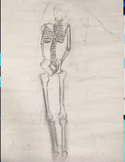
I always LOVED drawing skeletons! Although I was never very good at it, I loved drawing every detail in the ribs and spine, and finding out what is actually inside out bodies at the same time! Truth is, I only really wanted to learn how to draw skeletons just so I can draw fan art of my favourite skeleton characters (I will draw every single 'Undertale' character EVER, GOD DAMMIT!). But drawing a real life skeleton (or realistic-looking, I don't know) deemed to be tricker than expected, especially with the angle I was working with (I wanted to see it;s boney face!).

Cecil here (or Cecilia since it's apparently a girl) has some broken  bones to her as the structure kept falling apart as we were drawing. Nevertheless, I got to draw her spine which is hard but not impossible. The real hard part for me was the proportions. I couldn't think for my life how to fix this drawing when I saw that the ribs were too wide, the leg bones too long and thick and the pelvic bone a confusing mess. Despite my struggle it still looks like a skeleton, which was what I was aiming for and I succeeded so that's what matters! The spine was the same length as the real one and though I could do nothing for the skull, you can still tell it's the back of a skull due to the mouth area looking very bone-like. Also the shading on Cecil (ignore the smudged leg area) looks subtle and nice.

Life drawing has been proven quite hard after not doing it for a long time (Surprise, surprise) but I know it is expected of me to make a lot of mistakes at first. Because if every drawing I did was perfect, why am I even on this course?

"Long Way North" Review

[SPOLIER LEVEL: MINOR]

So I just went to see 'Long Way North' ('Tout en Haut du Monde') and it was beautifully dramatic.

Just from looking at the poster, I could tell it was going to have a line-less design where the shading would rely on darker versions of the base colours, not just black or brown. It's been a while since I've seen something like that so I was pretty excited to see it again, and sure enough I got what I wanted! The only lines you could see were the ones made for facial features like the nose and eyes, but overall it kept true to it's design.

The colours are from a creamy chalk-like palette, with the exceptions of when you would see an object being lightened by the sun, then it's like seeing a piece of gold wrapping paper right in front of you! My particular favourite background was the wide shot of icebergs with the sun shining on the tops on them.

The animation itself however can be a bit choppy. You can easily tell it was done frame by frame, which is fine! But whenever there would be a close-up shot of a character's face, frames can CLEARLY be seen missing when the lips move like an anime character's! I have to admit, it's weird seeing an anime technique in a French animated film. Despite all this, the long shots which show the characters  walking or running are smooth and all frames are in tact.

The story is about a young Russian aristocrat named Sasha, who escapades to the North Pole to find her missing grandfather, who is rumoured to have sunk with his ship when trying to plant the Russian flag into the North Pole.

Unlike the honest-to-God mess that was Don Bluth's 'Anastasia', the film's characters and events are all fictitious, so there are no misrepresentations of Russian history here! The story appears to be one thing but then becomes something completely different.

Sasha is a snobbish girl who dreams of more in life other than dancing with a foppish and "most unorthodox" prince (who is only in the film for the first 30 minutes so he's pretty much pointless). She at first replicates a cardboard cut-out of a 90's Disney princess, except she's more obnoxious. She assumes every poor working woman is her maid. So why is this film worth watching if she's the protagonist? Well, I kept thinking back to Chihiro from 'Spirited Away' and how much her whiny attitude annoyed me at first.  She did change and learn a lot of lessons throughout the movie. It wasn't her fault she was annoying, she just didn't know any better! It's the same thing with Sasha. She grew up in an aristocratic home and knows nothing about life outside of that. So when she does run away to find her grandfather, you feel satisfied when you see her being told off for being disrespectful and when she's being rewarded for working hard for her survival.

And yeah, let's talk about the running away scene. There's a pop song playing over it. Oh yes. There are pop songs in this films and I hate every single one of them. They do not match the 19th Century setting and they're pointless. The soundtrack itself though is lovely and worth listening to by itself.

And I know this isn't the film's fault but, the lip syncing of the English dub is really distracting! I know you can't fit all the words in a fast-speaking French character (in Russia) but at times the voice overs are still going when the character's lip stop moving! Who edited this?

All the characters in the story also have a similar arc to Sasha. You see them at first be cut-out and unlikeable, but as the film goes on they learn from their mistakes and build on their personality, making them more likeable, as if you're getting to know them bit by bit. The script itself is also in this category. You sense it might be predictable and go one way but ends up becoming a more dramatic story, where the characters  have close encounters with death and when they hurt themselves or are freezing cold, you feel every bit of pain with them. I swear the cinema got colder when they reached the blizzard! Or maybe cinemas are just always cold, I don't know.

Overall, 'Long Way North' is a beautifully coloured film with an intense storyline that you should DEFINITELY take the kids to! I am sick of seeing too many ******* kids movies being comedies. Give them some more drama in their cinema experiences!

7 compasses/10


Drawing for Animation: Toy Story

One of my first tasks on this animation course was to draw a toy going through different environments in any materials we want. The toy I based my drawing on was one of my first toys: a cuddly pony. However I don't have it with me at the moment so I had to draw it from memory. Let's say it's not the best representation! Although i am happy that I actually managed to make it look like a toy!


At first, I wanted to colour in my drawings with some markers I had, but I ended up using crayon instead because these markers went THROUGH the paper I was drawing on (nightmare)! These were some colour tests I did with the markers to see which colours went with what in their colour palette.


Ice Ice Baby...

This drawing was done in markers BEFORE I realised it it went through the pages! Here we see the pony toy inside a giant block of ice, frozen in time. The colours are mainly dark and light blue but I added green in the ice to try and add a nature-like essence. The markers ended up not blending together very well.


Do you want to Build a Snowman?

The toy walks through a park covered in snow (well, it's more jumping than walking). Drawing the back of the toy deemed to be quite difficult since the cuddly pony I had back at home had a bobbed tail. It's harder to draw than it looks, OKAY! I liked how the trees ended up in the end. The contrast between the light and dark brown are so prominent which makes them look more dimensional. Also, the background is so light and doesn't stand out much, allowing you to think the toy really is walking through the snow, since you barely see anything but snowy, pale, hazy colours like you would in real life.


Help! I'm a Fish!

Here we see the toy stuck inside a fishbowl at a grimy abandoned art studio. This time the colours are harsher to show the deterioration of the art studio, even though someone clearly still works there if there's a fishbowl there! Looking at this drawing reminds me of why I didn't draw much background. I always liked using this simplistic style of drawing only what it essential to the scene so that the audience can focus on what's there and the characters there too. A film that has recently become one of my favourites is 'The Tale of the Princess Kaguya' which also uses this design.


Some sort of metaphor…

The toy is smelling a lonely flower whilst an army surrounds a manor house in the background…I have no idea where these concepts come from. I'm pretty sure this is a subconscious symbol for something. Colours I used here are simple, although I did give the flower some shading and contrast between the yellows.

THE PLAGUES!

An earthquake is happening in the middle of the desert where the pyramids are located, and the toy just happens to be there!The colours go dark as you get closer to the cracks, but I feel like I could've made them darker. Although I used different shades of yellow and brown, the colours are mainly flat and there is no contrast. Also, what did I do to that pyramid? Bricks look nothing like that.


Surf's Up!

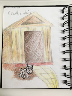
The toy is laying happily by a beach cabin, relaxed and ready for the sun! After walking around Falmouth town for a bit, I came across Swanpool Beach where it had multiple beach cabins in a row to the side. The cabins had a distinct birchwood colour to them and a sandy path next to them that led to the beach. These cabins were my influence for this cabin here. I believe I did capture the birchwood colour of the cabin with more yellows and browns for shading, however the path I drew looks less sandy and more like the yellow brick road.

OBVIOUS METAPHOR!!!

The toy has come to an end and is now being burnt to death on a battlefield. How it got there…I don't know. I know this is a very grim ending for the toy but my favourite colour palette to use are fire colours: reds, oranges, yellows, browns and ash black. I love the combination of them all and the element of fire itself is always fascinating to watch. I love how I managed to make burn marks and holes in the toy with only roller tip pen and crayons, and the fiery colours on the toy suit the grim war atmosphere well. RIP cuddly pony.

Introduction

The latest selfie of me so you know what I look like.

Myself in my own drawing style.

A Brief Introduction, because it's polite to do so.


Writing the beginning of this blog right now may not be the best idea, as it is 9:47pm and I get easily tired unlike all the other night owls in my building. I guess I have to get used to it being an animation student. The subject of animation is demanding and wants the best out of you. I aim to do that. That's why I'm at university for, to learn how to become the best I can in the subject I adore most.

My name's Louise, I'm an Animation and VFX student at Falmouth University and, despite knowing a lot about animation, I'm not experienced in the field that much. I've done some rotoscoping in the past on Animate CC, but nothing major. I love the pre-production side of animation but hardly know anything about post-production. I'm the sort of person who likes working hard on this blog and wasting time riding my swivel chair at the same time. Doing animation gives me both a sense of sanctuary and a sense of suffering, like every other animator I've met.

This blog would be a staple in my animation learning process, where I can be 100% honest with myself, so beware of some harsh critiques of my and other people's work.

I don't know where to go from here. If you like what I've written so far, I guess you should have a nosy around!