At first, I wanted to colour in my drawings with some markers I had, but I ended up using crayon instead because these markers went THROUGH the paper I was drawing on (nightmare)! These were some colour tests I did with the markers to see which colours went with what in their colour palette.
Ice Ice Baby...
This drawing was done in markers BEFORE I realised it it went through the pages! Here we see the pony toy inside a giant block of ice, frozen in time. The colours are mainly dark and light blue but I added green in the ice to try and add a nature-like essence. The markers ended up not blending together very well.Do you want to Build a Snowman?
The toy walks through a park covered in snow (well, it's more jumping than walking). Drawing the back of the toy deemed to be quite difficult since the cuddly pony I had back at home had a bobbed tail. It's harder to draw than it looks, OKAY! I liked how the trees ended up in the end. The contrast between the light and dark brown are so prominent which makes them look more dimensional. Also, the background is so light and doesn't stand out much, allowing you to think the toy really is walking through the snow, since you barely see anything but snowy, pale, hazy colours like you would in real life.
Help! I'm a Fish!
Here we see the toy stuck inside a fishbowl at a grimy abandoned art studio. This time the colours are harsher to show the deterioration of the art studio, even though someone clearly still works there if there's a fishbowl there! Looking at this drawing reminds me of why I didn't draw much background. I always liked using this simplistic style of drawing only what it essential to the scene so that the audience can focus on what's there and the characters there too. A film that has recently become one of my favourites is 'The Tale of the Princess Kaguya' which also uses this design.Some sort of metaphor…
The toy is smelling a lonely flower whilst an army surrounds a manor house in the background…I have no idea where these concepts come from. I'm pretty sure this is a subconscious symbol for something. Colours I used here are simple, although I did give the flower some shading and contrast between the yellows.
THE PLAGUES!
An earthquake is happening in the middle of the desert where the pyramids are located, and the toy just happens to be there!The colours go dark as you get closer to the cracks, but I feel like I could've made them darker. Although I used different shades of yellow and brown, the colours are mainly flat and there is no contrast. Also, what did I do to that pyramid? Bricks look nothing like that.Surf's Up!
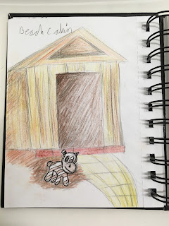
The toy is laying happily by a beach cabin, relaxed and ready for the sun! After walking around Falmouth town for a bit, I came across Swanpool Beach where it had multiple beach cabins in a row to the side. The cabins had a distinct birchwood colour to them and a sandy path next to them that led to the beach. These cabins were my influence for this cabin here. I believe I did capture the birchwood colour of the cabin with more yellows and browns for shading, however the path I drew looks less sandy and more like the yellow brick road.


No comments:
Post a Comment