For anyone who has ever studied film or is currently studying some form of film now, I'm sure they're familiar with shot compositions. For anyone who doesn't know, shot compositions are different types of proportion layouts for shots that are used to convey to the audience how they should feel or at least make the shot visually appealing. Shot compositions are also frequently mention when talking about the third principle of animation; Staging, where you essentially create the mise-en-scene of a shot along with using shot compositions to figure out where characters or objects should be placed on screen.
Shot compositions are very important references for film and animation as they allow us to create a proportioned mise-en-scenes for our film and therefore make it easier for the audience to understand the shot. But how can the audience understand the shot when the majority of them wouldn't know about shot compositions? We don't need to explain to others how to understand what they're feeling! Shot compositions are used because our eyes and mind have adjusted to viewing these compositions and instantly liking the proportions on screen. Certain compositions immediately tell us whether we should feel relaxed, happy, distressed or overwhelmed by a shot without us knowing about it.

The Rule of Thirds
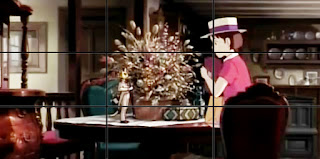
The rule of thirds is the most well known of the shot compositions and most likely the first composition you would learn about when studying film. It is when a shot is divided into nine and the lines created are used as a reference to where the characters or significant objects should be placed.
 The rule of thirds is a massive favourite to our eyes and mind due to how symmetrical it is. Having a character breaking the rules of the rule of thirds instantly makes us feel insecure as they are at a strange angle and not standing straight like a normal person does. This is why filmmakers use the rule of thirds the most in films as that's the one which is most needed, when it's for normal quiet scenes that are there to relax you not in the action scenes the film would lead up to.
[Rule of Thirds and "Whisper of the Heart" 1995]


The Golden Ratio
The golden ratio is a more complex version of the rule of thirds and required mathematics to create (geometry IS used in the arts). Golden ratio isn't just used in film, but in fine art and architecture as well. Leonardo da Vinci was a frequent user of golden ratio and used it as a reference for the Mona Lisa.
Like with the rule of thirds, our eyes and mind have come to a liking of the composition when seeing characters proportioned along the lines or within the circular layouts. However, unlike the rule of thirds where you feel relaxed when characters and objects are almost symmetrical, golden ratio can be used in any scene to make the shot more visually appealing to the audience.
[Golden Ratio and "Grave of the Fireflies" 1988]

Static Composition
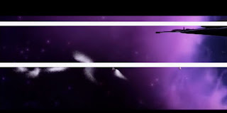
Static composition is where the shot has straight horizontal or vertical lines within it.
To our minds, we associate horizontal and vertical lines with being tranquil and levelheaded, as the majority of the world we see has a lot of these lines. When an object or character is proportioned to go up or down, we feel happier about the path because the path is straight and rarely any complications happen on the straight path.
[Static Composition and "Wall-E" 2008]
Dynamic Composition
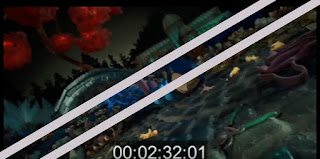
 Diagonal lines are not the straight path like horizontal and vertical lines. We are not used to seeing a lot of diagonal lines in our everyday world and therefore indicate when something wrong is happening when the camera tilts to the point where the set is diagonal or rows of people are sitting in a diagonal way.This is why we come to associate the winding road as the most dangerous road, since it's not a straight path and we don't see what's at the end of the road. The head tilt is also a good example. When someone smiles as their head is at a vertical angle, we smile back. However when someone smiles and their head is tilted to a diagonal angle, it comes off as something creepy and unnatural.
[Dynamic Composition and "Coraline" 2009]

Lead Room
Lead room or lead space is when the character on screen is given enough room to look to the side and face something. If your character is on left, make them look to the right and vice-versa.
 This allows the characters to be given some breathing space. It tells the audience that the character is going to think for a while and whatever the character is seeing could be of some relevance to the plot, so keep an eye out for that! This is also a good composition for two characters that are speaking to each other, where the camera can focus on one character, so the audience can also focus on that character. This also lines up with the rule of thirds as the two characters are in proportion to the lines of that composition.
When characters are not in line with lead room, it automatically makes the audience feel uncomfortable knowing they don't have enough space to look around and breath on screen, indicating these characters are not quite human.
[Lead Room/Space and "Kubo and the Two Strings" 2016]
Scale
Using scale as a visual tool is a great composition to convey to the audience how vast or tight a shot is.
By making the character small compared to it's environment, the shot indicates that this is a big or important moment in the film. It could also show how large a city is compared to our meek protagonist. However when the character is larger than the environment, the character appears more powerful than everyone, or shows that the character is thinking about how small and insignificant the world is really is, which makes the audience think it too.
Note: The Scale examples are talking about regular-sized humans, not giants or borrowers.
[Scale and "The Girl Who Leapt Through Time" 2006]


No comments:
Post a Comment